


Microsoft Teases Windows 10's Upcoming 'Project Neon' Design Language (windowscentral.com) 139
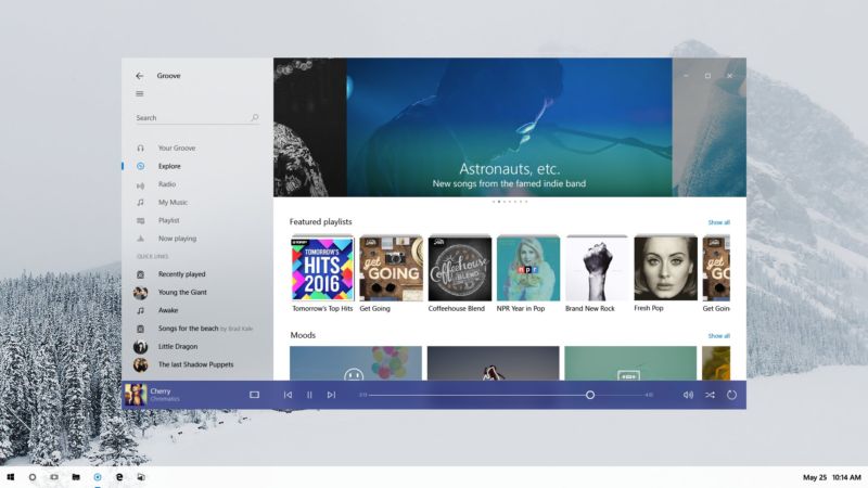
An anonymous reader quotes a report from Windows Central: Microsoft just gave developers a sneak peek at Project Neon, Microsoft's upcoming design language for Windows 10 that aims to add fluidity, animation and blur to apps and the operating system. We exclusively revealed that this was in the works in late 2016, and today Microsoft has given us a first peak at what Project Neon will look like. During the Windows Developer Day livestream, an image of Project Neon was seen the background of one of the PowerPoint slides being shown off on stage. Although not much, it's further confirmation that this is the end goal for Windows 10's UI, and Project Neon will be bringing a fresh coat of paint to apps. Project Neon should benefit all types of Windows 10 devices, including Windows 10 Mobile, HoloLens and even Xbox. We're still several months away from Project Neon being everywhere in Windows 10, and we're expecting to see more at BUILD this coming May. In fact, a lot of the Project Neon APIs are available in the latest Insider Preview builds of Windows 10, meaning developers can already begin taking advantage of these new user interfaces and design language! Animations and transitions are a big deal with Project Neon, with the goal of making the operating system and apps feel like they work together. Peter Bright does a good job summarizing the looks of the screenshot via Ars Technica: "The picture shows a refreshed version of the Groove music app on a Windows desktop. The fundamentals of the app and its layout aren't changed, underscoring that Neon is very much an iteration of the current Metro/Microsoft Design Language (MDL). The window has shed its discrete title bar and one pixel border, with the application content now extending to the very edge of the window. The search text field no longer has a box around it, and the left hand pane has a hint of translucency to it." You can view the screenshot here and judge it for yourself.

Re: (Score:2)
And will this moronic eye candy get in the way of the traditional desktop user as well? So long as I can turn the poxy animations off I will be happy.
Re: (Score:2)
Re: (Score:2)
Ugh Windows 10 has stuff like Aero! It'll get in the way! This sucks!
Never change, Slashdot
Re: (Score:1)
Nice false dichotomy.
Windows 2000 wasn't flat nor was it Aero. It was the best UI design Microsoft has ever had.
Re:Windows 10 (Score:4, Insightful)
Re: (Score:2)
Re: (Score:2)
More useless 'bells and whistles'
Except pretty much the opposite. It's a minor update to the existing theme, which was already founded on minimalism.
not useless, but not revolutionary. (Score:4, Insightful)
it's just a move towards back to windows 2000 gui rules.
you know, like input text boxes looking like input text boxes and buttons being distinctly buttons.
they make it sound all fancy and all that, but thats what it is. basically they're reinventing the wheel they spent tens of millions dollars to research in mid and early '90s.
a good example of how the current metro design language is fucked up is just the windows 10 installer. you have _choices_ where the other choice is a distinct box and the another choice is something that looks like a hyperlink buried in the text - both of these behave the same (take you to the next screen with the choice you made) but look totally different to the point that most users aren't even aware there is a choice to install it without a microsoft account.
Re: (Score:1)
> most users aren't even aware there is a choice to install it without a microsoft account.
That is a *very deliberate* use of the GUI to try and force everyone to have a Microsoft account. They can't legally force you but...
Re: not useless, but not revolutionary. (Score:2)
There's even a name for it -- "Dark UI Patterns"
http://darkpatterns.org/ [darkpatterns.org] is an entire website about them.
Re: (Score:2)
That's a stupid name too. Why not call it an intentionally misleading interface (which says what it is, no more and no less) without trying to imply witchcraft, aliens, or some quasi-masonic conspiracy..
Re: (Score:2)
it's just a move towards back to windows 2000 gui rules.
you know, like input text boxes looking like input text boxes and buttons being distinctly buttons.
Really? I read the article and looked for additional information elsewhere (because the article is lacking) and it looks like it's taking the "Metro" ideas even farther, with lack of window borders and and no discrete title bars. Some vast spaces of solid color have disappeared, but only because they're apparently encouraging the use of photos (e.g., as the main "background" image in an app) instead. This doesn't look better to me.
Dear Microsoft (Score:1)
Please fix the mass of significant issues present in the base operating system before diverting your dwindling QA resources to non-critical things.
Language? (Score:2)
What do they mean by 'Design Language?'
I see no verbs, nouns, adjectives, operators, variables, constants or other things than characterize a language whether human or programming.
Re:Language? (Score:4)
I studied design (admittedly not as a major and many moons ago) and I've no fucking idea what one is either.
Given what utter knobheads the UX herd are it probably means something entirely vague, utterly meaningless, or both.
Re: (Score:2)
They wouldn't have you. It was an entry requirement to be able to spell common words properly, or failing that to copy and paste them.
Re: Language? (Score:1)
got em XDDDDD
if you are are a designer and don't know what "design language" means, i'm more concerned for you than him.
Re: (Score:2)
Where did I say I was a designer? Wild guess: uou're an UXtard.
Re: (Score:2)
How would that help with arthritis?
Re: (Score:2)
I'm not a designer (not a visual or UX designer at least) but I do know what the word language means. I use a number of languages when I'm designing chips or software. I use languages when talking to people or writing. I have seen the term 'design language' in the context of computer languages for designing things. So I'm reasonably clear on what design language means.
If the one's who can't to mathematics starts adopting the wrong words for things, well that's a symptom, not a cause.
Re: (Score:2)
He doesn't know, but he thinks the answer is "Picton blue text on a Malibu background".
Re: (Score:2)
Remind me not to go to your school then. design langauge [wikipedia.org] is all the look of the thing. The Wii's design langauge was all boxy with the bevelled off corner; Apple's has changed over the years but it's always had some.
It's not exactly a new term, having been around since the early 1990s at least, if not older.
The kind of words they are are looking for are "visual style" or "appearance". English has perfectly good words for that. You don't need to use words that mean something else.
Re: Language? (Score:3, Informative)
This is the new, hip phrase for "style guide". The use of the word "design" makes you think that you'll encounter stuff that is well thought out and helps you accomplish tasks rather than gratuitous meddling with the look and feel plus the removal of real design elements such as signifiers.
Re: (Score:2)
Tuppenny wine in a ten-shilling bottle, like everything else tainted by the curse of UX.
Re: (Score:2)
Re: (Score:1)
Here is a great guide for you [bit.ly].
Re: (Score:2)
https://en.wikipedia.org/wiki/... [wikipedia.org]
Its a way of providing UX in a consistent way across many different contributors.
Re: (Score:3)
You are kidding right?
Its a way of providing UX in a consistent way across many different contributors.
In the real world with companies like Microsoft constantly changing their "design language" to make their products look new and different what you actually end up with is pointless confusion and inconsistent interfaces with nothing substantive to show for it in return.
Re: (Score:2)
Arty farty cool language and crap because they are a bunch of sick privacy invasive control freak perves and that doesn't sell nothing to no one except psychopath autocrats to control and abuse the nobodies, us. Selling the M$ brand is getting harder and harder by the day, they are screwed.
Finally (Score:1)
I know they have been trying for a *long* time to get the UI to a place where it is functional, looks clean and doesn't piss people off.
I have not used Windows on the desktop for at least a decade and don't plan on going back, but competition is always good.
I also hope that the Elementary OS guys get some inspiration from this. I use macOS now but open up my old Thinkpad just to check it out every once in a while.
Re: (Score:3)
If they were trying you'd expect them to have made some progress.
Functionality fell by the wayside when the UXtards moved in.
So even worse than before? (Score:5, Insightful)
So... "shed its discrete title bar and one pixel border"... "content ... to the very edge of the window"... "search text field no longer has a box". Sounds (and looks) to me like they've just regressed still further into the tiled layout, hey let's just make everything look like a congealed mess of applications and graphics with no visual cues as to which app belongs to what style of design. Just what the world needs (or not). Oh, and "hint of translucency to it" just to add some vista bleh to the mix (though to be honest I don't mind translucency and a bit of window animation so long as it doesn't hurt performance too much).
Clearly we've moved from the innovation and real development stage of UI design to stagnation and deck-chair shuffling phase.
Re: (Score:2)
To be fair the screenshot was pretty clear where the limits of the application are, with less dead screen area. Something that i'm finding increasingly annoying.
Take PDF files for example, why are they Portrait when most screens are landscape? The font sizes are designed for a page size typically 50% taller than your screen. So getting a page on screen means the fonts are uncomfortably small. The next issue is margins typically an inch round the page is white space! For a bit of paper that is fine we don'
Re: (Score:2, Insightful)
Somebody needs to take today's UI "design language" designers out back and smack them around a little. No need to break any bones, but bruises and a little blood wouldn't be amiss. Then introduce them to the likes of Motif. Make it clear that they understand that window borders should be discernible; that control elements like buttons and checkboxes should be unmistakably identifiable; that there should be reasonable contrast between text elements and background. The UI doesn't necessarily need to be as sha
Re: (Score:2)
Actually, you can polish a turd [youtube.com], which means Windows 10 is more like explosive diarrhea.
Re: (Score:2)
No, Windows 8 was explosive, watery diarrhea. Windows 10 is more like soupy pellets mixed with corn.
Removal of visual cues (Score:5, Insightful)
In other words, making it more difficult for people to figure out where the box is located to do anything. What next, will the search box be made 90% translucent and float around your screen?
Re: Removal of visual cues (Score:2, Interesting)
They could make it invisible until you mouse over it. Another good idea would be to put the field label in the field itself since space on a 1080 monitor is so limited.
Re: (Score:1)
The absolute worst example of this I've encountered was the insane recent trend for Linux DEs to have invisible vertical scrollbars, which only popped up when you hovered the mouse over the single pixel RHS border. Drove me frickin insane, especially since the scroll wheel doesn't work on a lot of Linux apps.
Re: (Score:2)
It doesn't need to be a box to have visual cues. I mean if you have trouble with the word "Search" a big line indicating there's something to do there, and a very obvious magnifying glass then it sounds like you won't be happy until you get Clippy coming up with "I think you want to search something, here, let me drag your mouse cursor to the place for you".
Seriously there's so much to complain about in terms of lost visual cues, and the only thing you got is the one element on the screen that is incredibly
Re: (Score:2)
What next, will the search box be made 90% translucent and float around your screen?
Probably not, but I wouldn't put it past them to display a "Search Bing!" link under the field as you type.
Or a better idea.... As you type your search, a sponsored advertisement appears under the field... "This search has been brought to you by Pepsi". That would be so awesome.
Re: (Score:1)
Re: (Score:2)
Usual useless fluff (Score:2)
"Project Neon should benefit all types of Windows 10 devices
At the expense of usability on the desktop.
Will this be another multi-gigabyte update that opens hundreds of simultaneous connections to download, not only making Windows 10 unusable, but shutting down your entire network and making every other device on it unusable?
Re: (Score:3)
> Will this be another multi-gigabyte update that opens hundreds of simultaneous connections to download, not only making Windows 10 unusable, but shutting down your entire network and making every other device on it unusable?
I mean, why should they answer that? Windows users will put up with it either way. This update takes away useful borders on applications and text boxes, makes all icons mostly indistinguishable and black-and-white, and generally makes it harder to know where anything is, what it d
Re: (Score:2)
Indeed. Windows 10 is already literally unusable for any serious purpose, unless you have a WSUS server of your own and a domain controller to enforce its use. It's like Microsoft is suffering from extreme depression, and is committing suicide.
I wish them all the best on that.
Re: (Score:2)
shutting down your entire network and making every other device on it unusable?
Ever heard of QoS?
Re: (Score:2)
You want to pony up the half million bucks it would require to replace our existing network, I'd be happy to. Otherwise, who cares what won't work?
Re: (Score:2)
Yeah, just TRY enabling QoS on a consumer-grade AP/Router. It'll KILL your throughput. Why? Because consumer-grade hardware doesn't have sufficiently-fast CPUs to actually inspect network traffic at gigabit speeds and make intelligent traffic-shaping decisions... they just implement "QoS" by arbitrarily limiting the bitrate from any one device to some fraction of what it thinks is the total link rate, exclude traffic on ports used by popular VoIP services, and call it a day.
With QoS enabled, I couldn't get
Windows classic (Score:5, Insightful)
I love window borders, title bars, scroll bars, and I want text boxes and clickable buttons to look like they're not part of the background please.
Design over function is never good for a tool. But if you want your OS to look like a toy, go ahead.
Re: (Score:3)
This absolutely!!! Even though Classic Shell was originally designed for Windows 8, I found that it works even better w/ Windows 10 once it's on there, and one has the choice of making it look like 7, XP or even NT. Every time I get any Windows 10 box, I install Classic Shell, and I'm good to go.
The ReactOS project should make Classic Shell its default UI, instead of trying to reinvent that wheel
Re: (Score:2)
Re: (Score:2)
I just want stuff to work --- work correctly, work as quickly as possible, and not get in the way of productivity. (I also prefer not to be spied upon).
When I've got, you know, things to actually get done, I'm not so much interested in glowing, dancing widgets, dissolves and fades, and bezeled ultrathin borders or whatever.
In short I want the OS to aid, not hinder, my work processes. (Which is why I use Linux and, seeing what's ahead, likely always will.)
Re: (Score:2)
Re: (Score:1)
People like you also complained about the UI changes in Windows 95, 98, 2000, XP, Vista, 7, 8.x, 10 and now these prototypes. Out of that list, the only one which is still regarded as a UX disaster is Windows 8.x. All others have retrospectively been recognised as generally good iterations on previous UI design.
The proof of the pudding? The most popular Linux DEs still imitate Windows' UI to this day. Give it 15 years and the 2032 release of Gnome will feature the same design language that you see in those
Re: (Score:2)
No we don't. Things improved up to XP (never used Vista). From 7 the decline set in.
Re: (Score:1)
Are you kidding? Windows XP was absolutely eviscerated by early-2000s techies for being a "Fischer Price OS" which looked like it was made for toddlers.
MS has rarely changed their design language without fierce initial criticism from tech enthusiasts and media:
* Windows 95 (Classic shell, 1995): derided upon release for being bloated, slow, clunky and unnecessarily changing "something which already works well"
* Windows 98/2000 (Classic shell, 1998-2000): a mild refinement of 95's UI which was warmly receive
Re: (Score:2)
Windows 10 (Metro, 2015): won near-universal acclaim for its UI changes, with the review tagline often being, "This is what Windows 8 should've looked like."
What that means is that the Windows 10 guys finally admitted what a disaster 8.x was, and put back much of Win 7.
That doesn't mean that the result was as good as Win 7, let alone better.
Re: (Score:2)
If all you bother about is how it looks you should be using a Mac.
P.S. I'm amazed that such an expert never found out how to engage classic style.
The designers have taken over (Score:4, Insightful)
Everything is tone in tone, low contrast and flat and there are huge amounts of empty space. FFS, send these idiots home and give them a modern art museum to play in. The computer is a tool, not a fashion accessory.
Re: (Score:1)
Alternate Headline (Score:3)
Microsoft Threatens Windows 10's Upcoming 'Project Neon' Design Language
Re: (Score:2)
Microsoft Threatens Windows 10's Upcoming 'Project Neon' Design Language
What did Microsoft threaten the design language with?
Re: (Score:2)
I was using the same pattern as "Russia Threatens Sanctions Retaliation", though it isn't as clear as can be.
Still, more clear than https://en.wikipedia.org/wiki/... [wikipedia.org]
Re: (Score:2)
I just think a "with" after the verb "threatens" would have made it more clear.
Or maybe "Microsoft Threat in Windows 10's Upcoming 'Project Neon' Design Language"
Two questions (Score:5, Insightful)
First, can it be disabled?
Second, when are you going to fix the spying?
Everything else, please talk it into the box over there, I'll ignore later.
Re: (Score:2)
> First, can it be disabled?
Yes, of course. You'll be able to download some program from someone that will add colors back, add a border back, etc. It will work intermittently and eventually the developer will leave on a ship and take the straight road to Aman, joining the other elves.
> Second, when are you going to fix the spying?
The spying was mostly fixed a few months ago, when they made it much harder for most of their users looking to disable it. Right now, the spying is working pretty well, b
Coming Next: (Score:4, Funny)
In Soviet Redmond... (Score:5, Interesting)
Microsoft increasingly reminds me of old Soviet times, where everyone knew the system was mostly done for and artificially propped up, with everyone knowing about the huge problems despite them being denied by the party, and huge and boisterous promises being made of what we'll have "really soon now", despite everyone knowing it's not ever coming to fruition. From time to time, some "achievements" were announced which either nobody really gave a shit about or that were simply and plainly fake. While at the same time the really pressing issues were never even addressed, let alone solved. There wasn't even an attempt to solve them. Instead, money was squandered away on gimmicky, flashy show projects that could be paraded. And the jokes reflect that from
"Little Vova, where's your dad?"
"He's in orbit, but will be back in an hour."
"And your mom?"
"Oh, that could take a while, she queued for butter!"
to
"Comrades! In 5 years we'll all have cars!"
"Yes, yes, but right now, we'd really need some toilet paper."
"And comrades! In 10 years we'll all have our own house!"
"Fine, whatever, but about that toilet paper..."
"Shut up! Kiss my fuckin' ass!"
"Great, so you have a solution for yourself, but what should we do?"
Re: (Score:1)
Everyone is entitled to their opinion but their opinion should be formed and expressed with a strong factual background. Since it's inception MS Windows has dominated the OS and application market. They have accomplished this in both the personal and business user space. But the computer landscape is constantly changing with the advent of new devices and cloud space related technologies.
And MS has successes and failures in their products. However name one successful company that has a perfect track record.
Re: (Score:1)
Wow, you couldn't do that without an ad hominem? C'mon, did MS now even axe the money to train their shills? Don't tell me they outsource that to India now, too.
Anyway. aside of the "oh you don't know computers and it's so obvious I don't even have to point it out", what you offer is the usual "if you don't like it, make your own, preferably with blackjack and hookers" gambit. C'mon, you can do better than that. But ok, ok, I bite.
Making your own is pointless. For the exact same reason that the already exis
Re: (Score:3)
Microsoft is good at one thing: market domination. I give them credit. They have taken crappy products, made them continuously crappier, and dominated some --- what--- 90% of the market.
Give them credit, that's not easy to do.
Re: (Score:1)
People like you have been predicting Microsoft's demise since at least 1995's introduction of Windows 95, and certainly every year since. Yet here Microsoft are, in 2017, still one of the world's biggest companies but now with a much bigger portfolio of products, many of which are recognised as one of the best in a particular market:
* Cloud computing: Azure
* Online
Re: (Score:2)
So, for the last 20 years, Microsoft expanded into the above markets and received widespread acclaim for the products listed.
But not for their core product, namely Windows.
The last Windows to receive widespread acclaim was Win 7. Since then, nothing but one disaster after another.
nobody... (Score:1)
Well, let's see then (Score:5, Informative)
To summarise: Yuck.
Re: (Score:2)
A guess: they expect you to click and drag the content? Their focus upon touch is massively detrimental to everyone else.
Yesterday's style (Score:2)
The most laughable thing is that flat, sparse style is already old. The hip people have already moved on to multi-stop, overlapping, translucent, rotated gradients. Complex gradients. If you want to make a stylish UI, you need to use them. Microsoft is trying to chase trends and n
Long live Winforms (Score:2)
Clear, easy to understand, and classic. Shame this very old tech isn't available cross platform (that I know of). Tis a solid base.
Corporate folk don't want the shine, they want the very clear to use (make sure and tell them, time after time, about context menus...).
Oh great (Score:3)
hmm (Score:1)
Are there people on /. in the year 2017 that AREN'T exclusively using unix and unix-like operating systems? You guys know macOS already looks chic and doesn't impose nonstop brain damage upon its users, right? All of the settings are in one application too.
MS doesn't have a current UI for business apps (Score:2)
My team is in the process of migrating a large Windows app from a legacy language to C#. After evaluating the various UI options, we've reached a sad conclusion: MS doesn't actually have a viable UI framework for business apps at this time.
Windows Forms - legacy, in maintenance mode. Shouldn't be considered for new app development.
WPF - A single update, a few years back. Cringeworthy level of complexity and tooling suckiness, can't even subclass a button without having to copy-and-paste XAML from the pa
Is it really neon? (Score:1)
Re: (Score:2)
Re: (Score:1)